Contents
Colors
Since late May/early June 2023, all “evergreen” browsers (Chrome, Edge, Firefox, Safari) have capability for the new OKLCH color model. And in each of these browsers, the hue/ chroma/ lightness color channels can be separately controlled by CSS variables.
From Baselayer v.2.0.0, the color utilities have been provided in separate streams. You only need to choose one of these stylesheets:
Baselayer 2 core
Has only a few required base theme # colors (set in the root CSS variables)
Baselayer 2 core
+ OKLCH utilities
Required base theme colors are reset as OKLCH root CSS variables
Baselayer 2 core
+ HSL utilities
Required base theme colors are reset as HSL root CSS variables
These download options can be found in the source output folder.
If a browser does not support oklch() then baselayer-oklch.css will fall back to these Baselayer # colors — and all the color utilities will be ignored.
If you much support older, pre-OKLCH browsers, then you must use either baselayer-hsl.css or baselayer.css and add your own HEX # colors.
At the time of writing these docs (July 2023), the HSL color model has wider support, having been implemented in some browsers since 2010. The Baselayer HSL utilities will continue to be available as an alternative (not a fallback) in Baselayer v.2.x.
Rationale for Baselayer’s color systems
I wanted to develop a color system that was based on CSS variables for generating a series of shades for each color, so that the stylesheet didn’t need to be loaded with all the shade permutations of each color — most of which you would probably never use in a project. This meant finding a color model with a lightness channel that could be controlled by a CSS variables, which I could then apply to numerous hues.
For this purpose, the HSL model almost gave me what I needed. Therefore Baselayer 1 used the HSL color model from CSS Color Module Level 3 because hsl() had a lightness channel that I could control. However, I found that when building the various HSL color lightness series, it was not possible to get the various colors to look perceptually uniform while using the scale lightnesses for each (i.e. the Baselayer color shade classes *100 through *900), whatever combination of hue and saturation I tried. Choosing HSL hue+saturation combinations for different colors that worked tolerably well against the same set of lightness levels meant that the mid-range colors would look less vibrant / “washed out”.
If the muted look is what you’re going for, or you need to support pre-OKLCH browsers, then stick with Baselayer 2’s HSL system in baselayer-hsl.css. But if you want your colors to “pop” go with Baselayer 2’s OKLCH system in baselayer-oklch.css (from CSS Color Module Level 4). OKLCH looks really great in shades. 😎
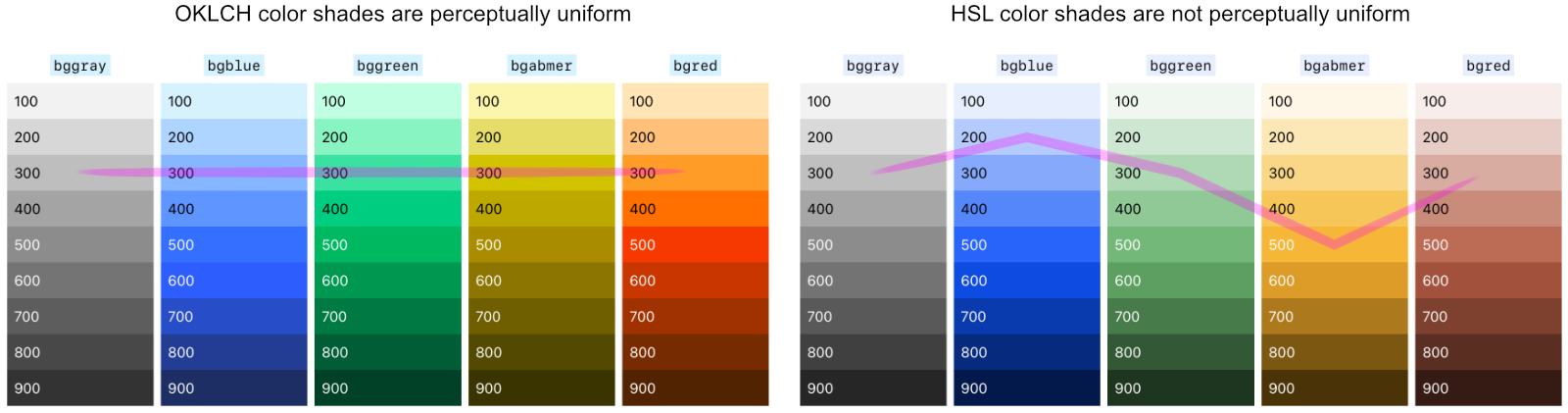
So, the colors in Baselayer’s HSL and OKLCH systems are not the same colors — the OKLCH colors are more vibrant. To see the difference, play with the colors toggle while looking at the color shade utilities demo below.
More on HSL and OKLCH:
- HSL color finder by Colin Swinney
- LCH colors in CSS: what, why, and how? by Lea Verou
- It’s Time to Learn oklch Color by Keith J. Grant
- oklch.com color picker and converter by Evil Martians
- OKLCH in CSS: why we moved from RGB and HSL by Andrey Sitnik and Travis Turner (Evil Martians)
- LCH and OKLCH color tool by Atmos.style
- High Definition CSS Color Guide (Google)
Baselayer 2 core colors
Each version of Baselayer 2 contains the baselayer.css core (v.2.x), which also contains a few of its own base theme colors — e.g. colors for text, fineline details (table borders, horizontal rule), form elements and buttons. In baselayer.css these are set in the :root{} CSS variables mostly as three letter # codes:
/*
Base theme colors
*/
:root {
  --cbgbody:  white;
  --ctext:    #222;
  --clink:    #06f;  /* link text */
  --clinkh:   #02b;  /* link text hover */
  --cfocus:   #4cf;  /* input & button (not link) focus ring */
  --cbginput: #eee;  /* input background */
  --cbtn:     white; /* button text */
  --cbtnh:    white; /* button text on hover */
  --cbgbtn:   #777;  /* button background */
  --cbgbtnh:  #666;  /* button background on hover */
  --ccode:    black; /* <code> text */
  --cbgcode:  #eef;  /* <code> background */
  --cborder:  #ddd;  /* Finelines (table borders and HR) */
}
Except for those set by the color names white or black above, these theme colors are overridden as OKLCH colors in baselayer-oklch.css or as HSL colors in baselayer-hsl.css. Therefore, in either of these Baselayer+color utility packages, you only need to be concerned about setting colors in your chosen color models.
The Baselayer core baselayer.css does not contain any color utility classes — it only has a few required set colors e.g. for text, table borders, forms and buttons, and these are set by CSS variables. Meanwhile, in baselayer-oklch.css and baselayer-hsl.css, both sets of color utilities use the same CSS class names. So if you switch, you won’t need to modify your HTML.
Color utility classes
Since both baselayer-oklch.css and baselayer-hsl.css use the same CSS classes, we can describe once how they both work in the HTML.
Baselayer color utility classes are prefixed acording to where the color will be applied:
b*— border color /h:b*— border color hovert*— text color /h:t*— text color hoverbg*— background color /h:bg*— background color hover
Example border, text and background utilities:
<div class="b3 bgreen p2">...</div>
<div class="b3 p2 tgreen">...</div>
<div class="b3 p2 twhite bggreen">...</div>
Each of these colors is set at the 500 shade level in the Baselayer color scale, by default.
The colors are as follows (demo uses background colors at the default bg500 lightness):
bgblue
bggreen
bgamber
bgred
bggray
bgblack
bgwhite
bgreversi
You can use Baselayer colors for user interface (UI) components: blue for “information”, green for “success”, amber for “warning”, red for “danger”. Alternatively, you can dedicate particular hues to those purposes, and then swap out the Baselayer default hues for hues that fit your project requirement (e.g. corporate style guidelines).
There’s also utilities for For black, white, reversi, and transparent — see other Baselayer color utilities.
* selector.
This is how it works (simplified examples):
The SAME HTML is used for either color system:
<div class="bggreen">
  ...
</div>
oklch() requires no commas (it breaks if you add commas), whereas hsl() requires commas (it breaks if you leave out commas).
Color lightness (shades)
both OKLCH and HSL lightness channels are controlled separately by supplemental classes for each shade, and there are hover states for each shade.
Demo of color shades using background colors:
100 thorugh 900 if used alone, do not provide color. But if you use them to supplement one of the other colors above, then the color class will provide the color, and the shade class will set the lightness level.
- Border lightness:
b100throughb900- Hover state:
h:b100throughh:b900
- Text lightness:
t100throught900- Hover state:
h:t100throughh:t900
- Background lightness:
bg100throughbg900- Hover state:
h:bg100throughh:bg900
Of course, there are no shades of *black and *white — use *gray and shades for a grayscale.
Example usage:
<div aria-label="Note" class="popout mb2 bl3 bamber b300 p2 tblack bgamber bg100">
  Alert panel.
</div>
Adding more colors the “Baselayer way”
To add more colors the, you would need to convert them to oklch() format or hsl() format, declare the variables in the * universal selector, and set up the default (lightness 500) color utilities. The color shade utilities will take care of everything else.
Utility classes for colors: b* = border; t* = text; bg* = background.
Other Baselayer color utilities
Other color utilities included in Baselayer cover black, white, and transparent, as follows:
Black and white
- White — named color
white:bwhite/twhite/bgwhite,h:bwhite,h:twhite,h:bgwhite,
- Black — named color
black:bblack/tblack/bgblack,h:bblack/h:tblack/h:bgblack,
Reversi / Reversi opposite
Baselayer 2’s reversi color utilities can be used for flipping from black to white (and the opposite way) depending on whether the user is viewing your site in its light theme or dark theme. E.g. use *reversi and *revopp utilities for a dark/light theme toggle button or for brutalist web designs.
- Reversi —
blackon light theme;whiteon dark theme:treversi/.breversi/.bgreversi
- Reversi opposite —
whiteon light theme;blackon dark theme:trevopp/.revopp/.bgrevopp
Transparent background
E.g. for outline buttons.
- Transparent:
bgtransparent
There are no hover states of bgtransparent.
Colors and accessibility
In your text and background color combinations, be careful to ensure that the text is readable — there needs to be an adequate contrast. Generally, you will want to aim at WCAG level AA for accessibility compliance.
For WCAG level AA compliance, most user interface colors need to be darker than the middle shade (i.e. use *600 up) if the text color is white, or lighter than the middle shade (i.e. use *400 down) if the text color is black.
However, any colors near yellow, such as Baselayer amber, as well as orange and yellow-green (not included) are notoriously difficult for accessibility. You may do better using a lighter background amber and pairing it with black text.
When colorizing buttons, remember to set their h: hover state shades too.
/* Default button */
<button type="button" name="button">Button</button>

/* Blue button */
<button class="bgblue bg600 h:bg700" type="button" name="button">Button</button>

/* Amber button */
<button class="tblack h:tblack bgamber bg300 h:bg400" type="button" name="button">Button</button>

/* Green outline (a.k.a. ghost) button */
<button class="b1 bgreen bgtransparent bg600 tgreen t600 h:b700 h:twhite h:bggreen h:bg700" type="button" name="button">Button</button>
Background reading on colors and accessibility (not much is available about OKLCH at this time, mid-2023):
- Useful blog posts from The Accessibility (A11Y) Project:
- Using HSL Colors In CSS (Smashing Magazine)
- Web Content Accessibility Guidelines (WCAG) 2
- Contrast and Color Accessibility (WEB AIM)
- The Coolors contrast checker has an HSL picker option
- https://contrast-ratio.com has an HSLA contrast checker (HSL plus opacity)
- Web Accessibility: Understanding Colors and Luminance (Mozilla Developer Network Docs)
Baselayer’s dark theme
Baselayer 2 has some simple dark themes built in, controlled by a JavaScript toggle in this documentation.
Each Baselayer 2 variant has a dark theme, that sets dark theme colors for the HTML tags. These are set using # in baselayer.css, oklch() in baselayer-oklch.css and hsl() in baselayer-hsl.css.
Example from baselayer.css:
.theme-dark {
  --cbgbody:    #222;
  --ctext:      #ddd;
  --clink:      #39f;
  --clinkh:     #07f;
  --cbginput:   #444;
  --ccode:      white;
  --cbgcode:    #228;
  --cborder:    #ddd;
}
(There’s also the flipped colors for reversi / reversi-opposite.)
Both baselayer-oklch.css and baselayer-hsl.css have color utility lightness classes — and both these sets of shades are necessarily darkened a little for the dark theme. E.g. see the following graph:
Baselayer 2’s OKLCH shades (lightness) are darkened for the dark theme
The Baselayer 2 HSL darth theme shades are similarly darkened.
Dark/light theme toggle
Baselayer’s dark/light theme switcher JavaScript uses sessionStorage in the user’s browser to remember their theme preference as they visit multiple pages in this website in any one “visit session”.
This script is embedded in the <head> of the webpage and it is read early so that it is implimented before the <body> is painted in the browser window.
The theme switcher in the Baselayer 2 docs is built into its switcher.js sidebar demo toggling system. If you want to use the same dark/light mode toggler, here it is isolated below (no JS framework required):
const matchMediaDark = window.matchMedia('(prefers-color-scheme: dark)');
const htmlClassList = document.querySelector('html').classList;

function themeDark() {
  sessionStorage.setItem("baselayerTheme", "dark");
  htmlClassList.remove('theme-light');
  htmlClassList.add('theme-dark');
}

function themeLight() {
  sessionStorage.setItem("baselayerTheme", "light");
  htmlClassList.remove('theme-dark');
  htmlClassList.add('theme-light');
}

function toggleTheme() {
  if ( sessionStorage.baselayerTheme === 'dark' ) {
    themeLight();
  } else {
    themeDark();
  }
};

function baselayerInit() {
  if (sessionStorage.baselayerTheme === 'dark' || (!('baselayerTheme' in sessionStorage) && matchMediaDark.matches)) {
    themeDark();
  } else {
    themeLight();
  }
};

baselayerInit();
You will also need a toggle button, like the one in the sidebar. The checks (ticks) are added in by CSS pseudo-selectors.
Another, simpler example theme toggle button, with glyphs from &what;
<style>
  .theme-dark .theme-toggle span::before { content: '☀️ '; }
  .theme-light .theme-toggle span::before { content: '🌙 '; }
</style>

<button class="theme-toggle trevopp bgreversi" onclick="toggleTheme()">
  <span>theme</span>
</button>
The simple example above uses bgreversi to put a “night time” black background behind the moon and a “day time” white backgorund behind the sun, and trevopp (reversi opposite) to flip the text color the opposite way.
If you don’t want to give your visitors the option to toggle, then you can also change the CSS to make the dark theme simply respond to the prefers-color-scheme: dark instead.
@media (prefers-color-scheme: dark) {
  /*
  Your dark theme styles
  */
}